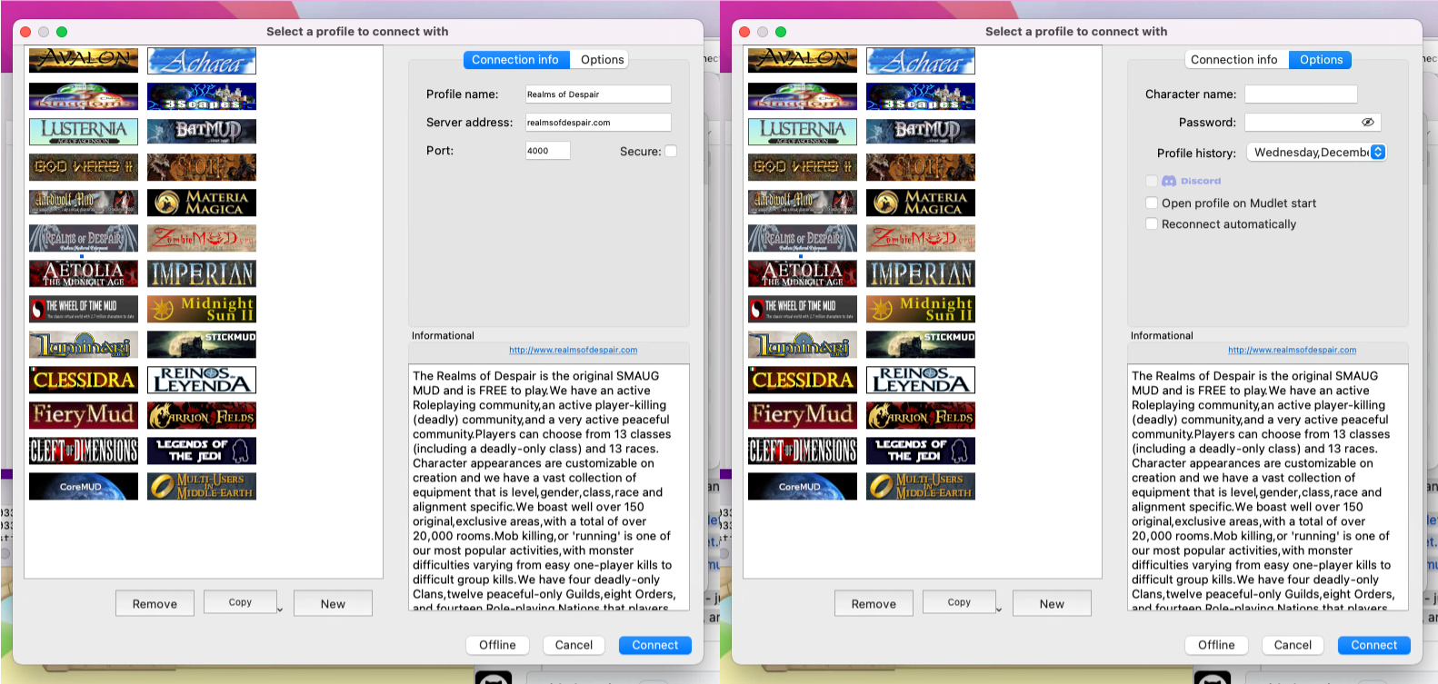
The current connection dialog displays a lot of information at once – which for a first time player is often just too much.
So we thought – how about we move some of the non-essential fields out of the first view – into an “Options” section that is hidden by default? We developed two designs how this could look like and reached out to our decision maker patrons on this –
After some days of voting, the results are clear – the latter option 2 is the way to go! Look out for this in the upcoming Mudlet 4.16.
Enjoy Mudlet,
Vadim


